How do I recolour images in Ren’Py that look good? What kind of base images do I need to make a good engine recolour? Can Ren’Py really colorize images with complex shading styles? If you’ve ever tried to colorize images in Ren’Py, you might have asked some of these questions.
Recently I’ve released a shader, Better Colorize for Ren’Py, and an accompanying Colorize Tool on itch.io so you can get the best results out of recolours. However, you might be wondering where to start, and how to achieve the best results. This tutorial will walk you through taking a standard grayscale image and recolouring it using the tool.
You will need to pick up Colorize Tool for Ren’Py to get started! Find it for free on itch.io below:
You should already feel comfortable with using images in Ren’Py, and it will be helpful if you know a bit of ATL so you can understand how to apply the shader to your images.
Setup
To start, this tutorial will not be going over how to make images for the tool – that’s covered in a different tutorial, coming soon! Roughly, the simplest way to get started will be to take some separate layer like a hair layer and make it grayscale.
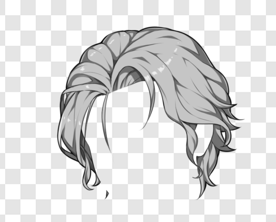
In this tutorial, we will look at recolouring two images with two distinct art styles. The first is a hair layer for the character Cove from Our Life: Beginnings & Always. Our Life uses a cel-shaded style, with shiny highlights and dark line art. The second image is the hair layer for Corvin from Changeling, which uses a much softer style without distinct line art.
Image 1: Cel-shaded
For this image, I’ve just taken the original image and made it grayscale. There are only really 5 colours present in the original image, which makes replicating it quite straightforward.
Matching the original colours
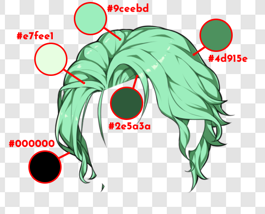
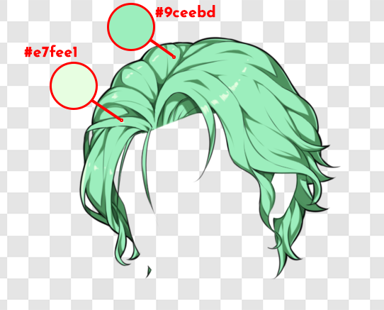
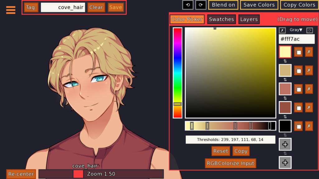
I like to work from the lightest colours to the darkest colours when colourizing an image, since you can always add more colours at the end of the current set of swatches and new swatch thresholds begin at 0. So to start, let’s pick out the lightest colour in the colour image. That would be the highlights here, on the hair. That colour is #E7FEE1.
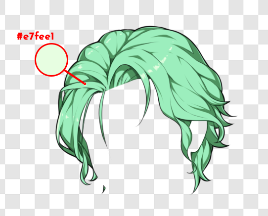
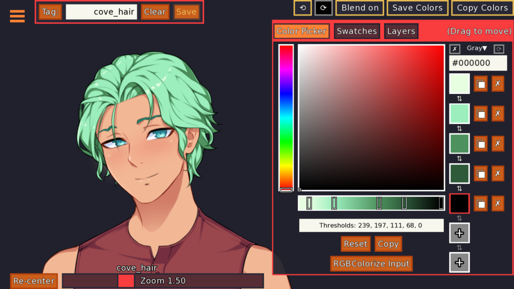
In the colour tool, I click the first swatch, since that’s the lightest one. Then I click on the hexcode box and it prompts me for input.
Here, I paste in my colour code, #e7fee1.

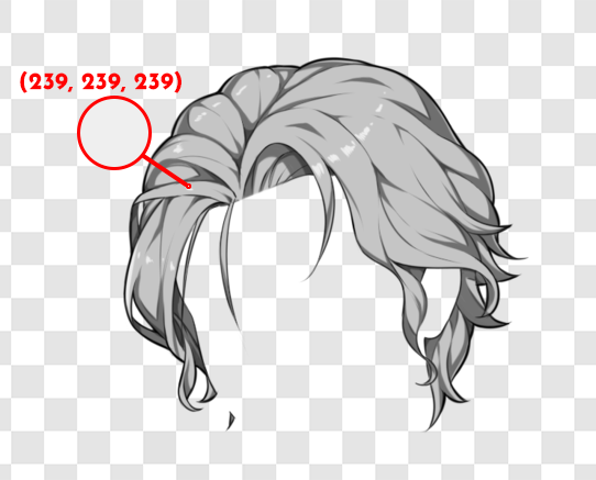
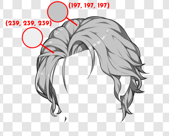
Now you can see that light green colouring a bit of the hair, but it’s not contained just to the highlights because I haven’t adjusted the thresholds. To get the threshold number, we need to look at the grayscale base image and colour pick off of that in the same spot. It shows me the colour #EFEFEF, but the important thing for this colour isn’t the hexcode, it’s the RGB values (aka the Red-Green-Blue values, sometimes shown as RGBA – the A is for Alpha). In this case it’s (239, 239, 239, 1). The threshold will take the greatest of the first three values. In this case, that’s 239. This number is important because the shader will look at these values, too – anything above a threshold gets mixed with the colour above it, and anything below a threshold gets mixed with the colour below it. If a colour is exactly at a threshold, it won’t be mixed at all and will only be that colour.
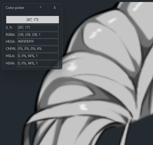
Note: If you need a good colour picker and image viewer, I highly recommend ImageGlass, shown in the screenshot above. It can natively view many image file types including webp, and has a built-in colour picker you can access with all the information you need for the colorize tool.
Next I will adjust the first thumb of the threshold slider to be equal to 239. If you’re having a hard time getting the exact number with the slider, you can also click on the input box below the bar to type in the numbers directly.
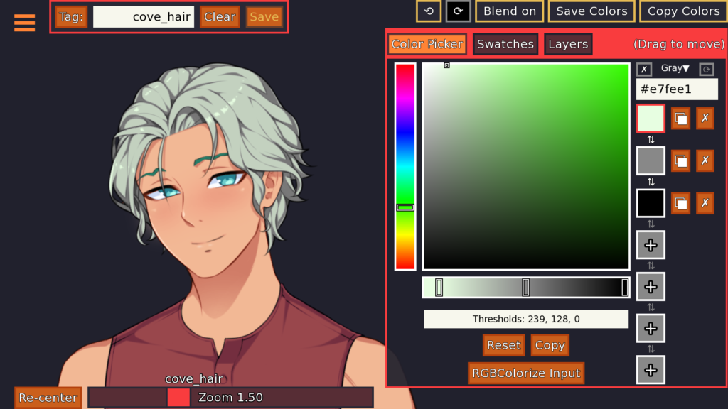
Now the very pale green shows up more prominently on the highlights of the hair, and you can see more of it blending with the main hair colour. We will repeat the same process for the next brightest colour, which is the main green of the whole image. Its colour code is #9CEEBD, and the corresponding RGB on the grayscale image is (197, 197, 197), meaning the threshold should be 197.
You’ll notice that even before you apply the colour, adding the second threshold will restrict the highlights to just the lightest part of the hair, which is what we want.
And it’s already looking very similar to our target image! We’ll continue the same pattern for the next two colours to add more depth – first the middling green used for the shadows, and then the darkest green in the crook of the hair. I’ll click the [+] in the swatch column to add another swatch to the list.
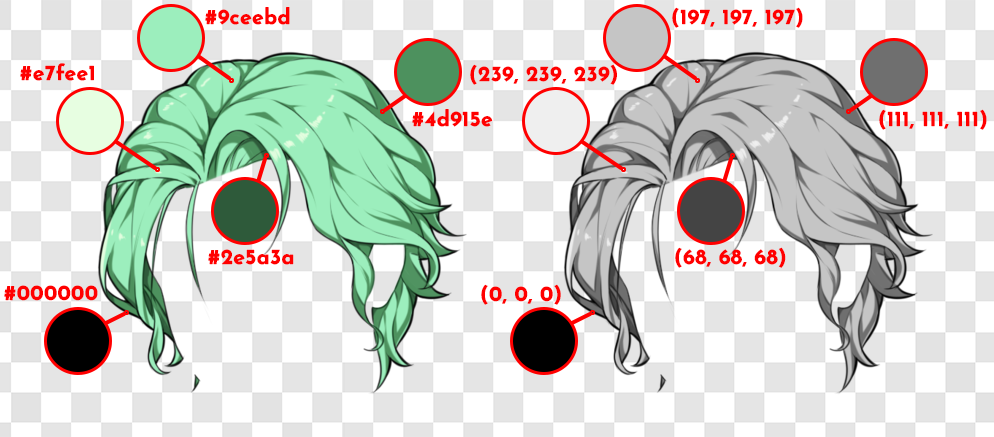
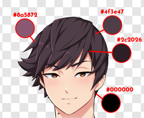
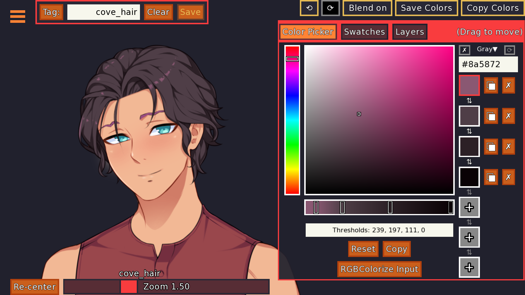
The last step is grabbing the colour for the line art, the darkest shade in the image. I’ll click the [+] in the swatch column again to add another swatch for this fifth and final colour. The colour for the line art is #000000 and the RGB from the grayscale image is 0.
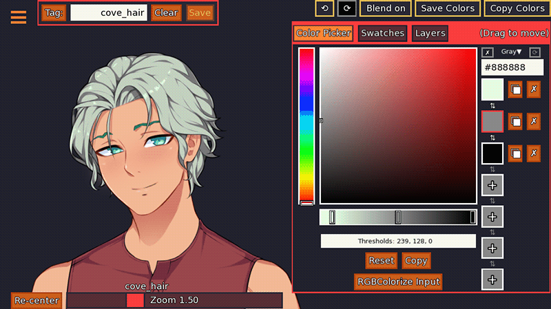
And tada! We’ve perfectly recreated the original colour scheme once again. Here’s a comparison image with the hand-coloured version next to the one we just made:
New colours
Of course, most of the time you don’t want to just replicate the original colours of an image, but to allow for new colours. Now that we have the thresholds in place from the last image, we don’t have to change them when we input new colours, since they’re associated with the shades of the base grayscale image and not the colours we’re adding on top.
How do you get new colour palettes?
The first way is just using the colour picker to experiment and adjust as you go until you get something you like. The second way is to colour pick off of images in the same art style, such as other sprites in your game. And lastly, you may also get your artist to provide you with colour swatches you can use for recolours (without the artist needing to recolour the whole image by hand).
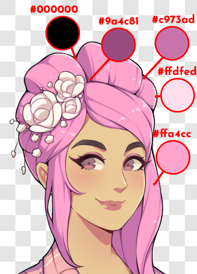
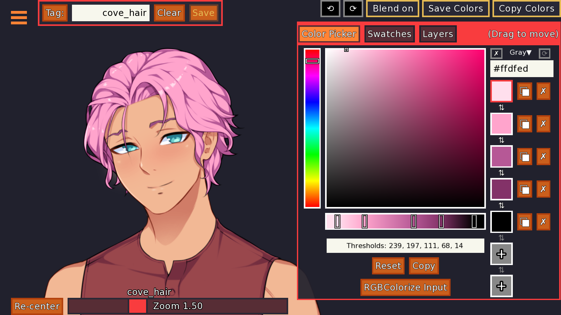
In this case, I’ll be picking colours off of other characters’ hair in Our Life. (See the second image example of Corvin’s hair for examples of picking colours freely.) Let’s start by making Cove’s hair match his dad’s hair colour.
And with those plugged into the tool, retaining the thresholds from earlier, this is the result:
Here is another example, picked from Xavier’s sprite:
And a final example, picked from Baxter’s sprite:
For this particular example, there are only four distinct colours on Baxter’s hair, so I removed the second-to-last swatch on Cove’s hair and let the shader interpolate a slightly darker shade to put in the crook of his hair. You can remove a swatch by clicking the ✗ to the right of the swatch.
Image 2: Painterly Style
You might also be wondering how to go about picking colours for an image which doesn’t have the kind of obvious colour thresholds as the cel-shaded style. Luckily, the colorize shader doesn’t just replace colours, but blends between them along a gradient, so you don’t have to pick out every single colour that appears in the image individually.
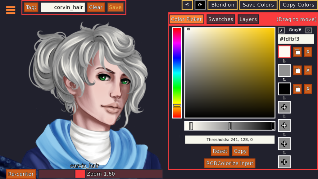
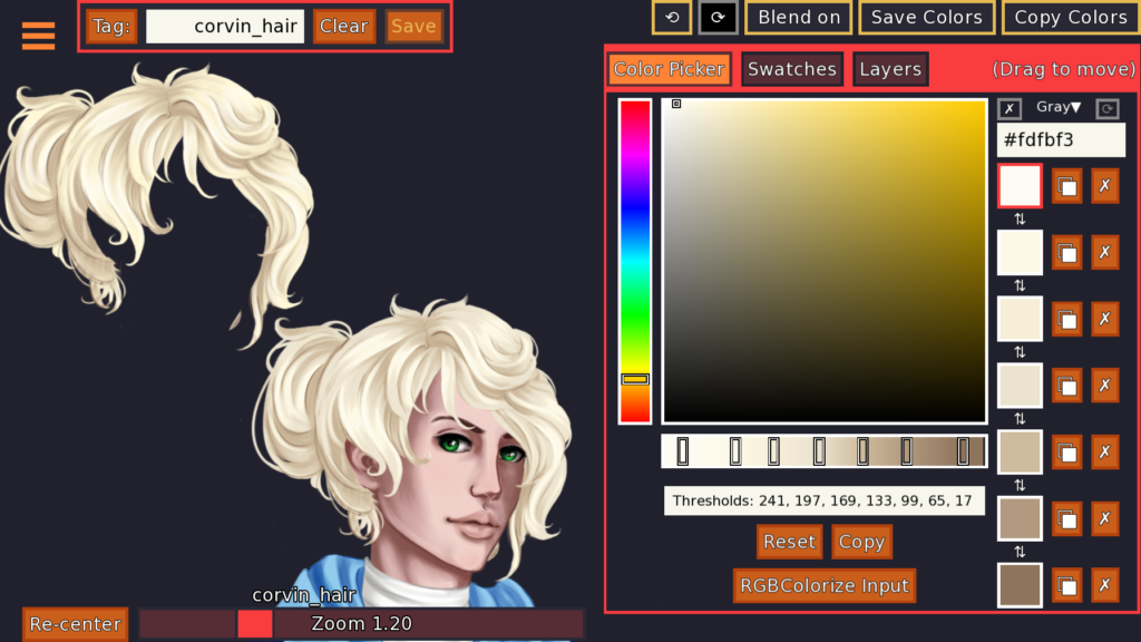
Let’s look at Corvin’s hair from Changeling and see if we can replicate the original colouring.
Matching the original colours 2
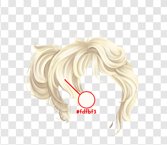
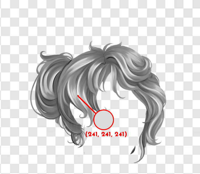
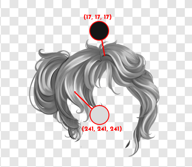
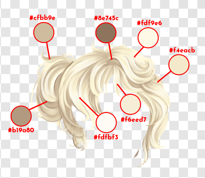
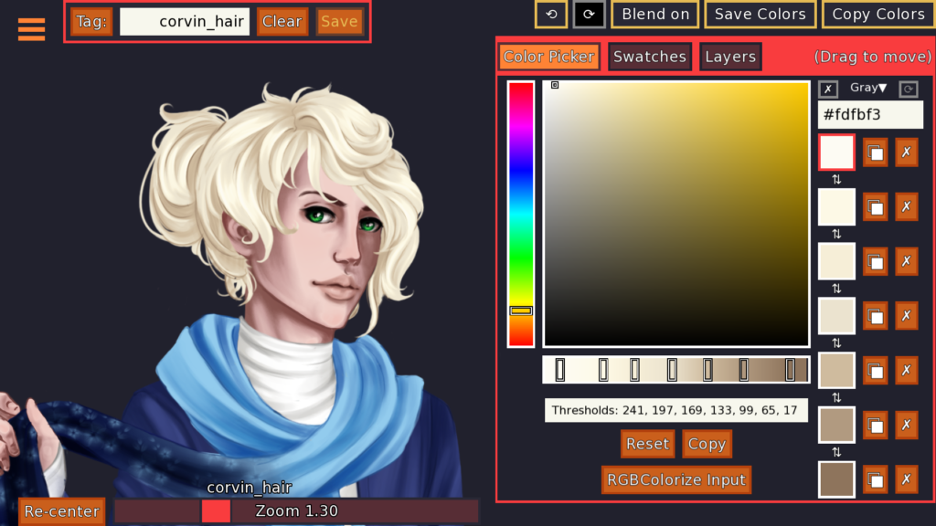
The procedure to match this kind of style is very similar to the approach for cel-shading – we’ll start by picking out the lightest colour on the image and plugging that into the first colour swatch. In this case, it’s here on the grayscale base with an RGB of (241, 241, 241), so I’ll set the threshold to 241. That same spot on the original image has #fdfbf3, so we’ll plug that into our first swatch.
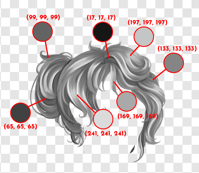
Next, there’s more freedom here in deciding what the next midtone colours should be, and how many of them you want to use. If you have distinct colour areas, you can choose from those. Otherwise, another good technique is simply to search around the base image for RGB numbers that are a decent distance from one another so the shader can blend between them. In this case, I’m going to use all 7 colours. My lightest colour has an RGB of 241, and my darkest is 17.
This means the 5 remaining colours between the lightest and darkest should be around 30-40 apart (241-17 = 224 → 224/6 = 37.3)
Note: If you aren’t trying to replicate the colours from an existing hand-coloured image, like we are here, it can also be sufficient to just evenly space the thresholds between the lightest and darkest thresholds. If we did that for Corvin’s hair base, we’d get the thresholds [241, 204, 166, 129, 92, 54, 17], which would also work well for this blended art style. Essentially you want to pick your “anchor” colours – in this case the highlight and shadow, but you could also include a midtone or two – and then add a few swatches & thresholds in between them to customize how they blend better.
I continue on in this pattern, grabbing the colours as shown below:
And this is the final result! For this kind of style, sometimes you might find that you’ve chosen a colour that’s actually lighter than a previous one, or that you have the swatches in the wrong order – in this case, you can use the ⇅ arrows between each swatch pair to swap the order.
And here’s how it looks compared to the original, hand-coloured version.
New Colours pt 2
Like last time, obviously a major benefit to colorizing an image is experimenting with new colour palettes. As before, you can either get new palettes through experimenting with the colour picker, by picking off of images in the same art style, or having your artist create additional palettes for you.
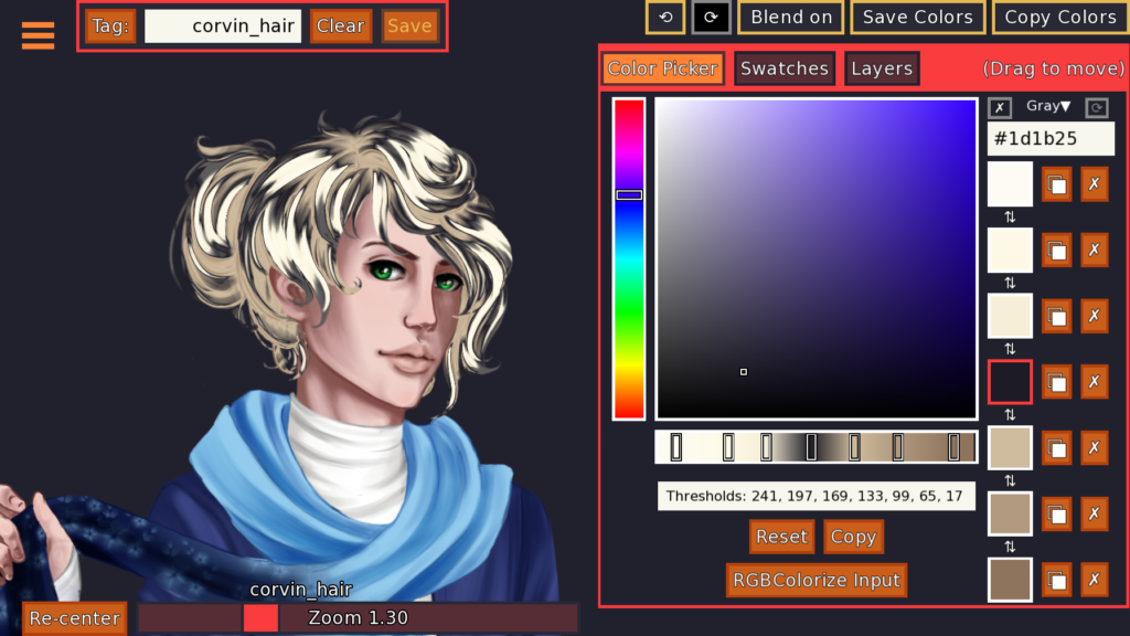
Example 1 (Black)
Let’s try to give Corvin black hair by choosing colours in the colour picker. You can start from whichever direction you like; I’m going to start out by picking out a “main” colour for the middlemost swatch.
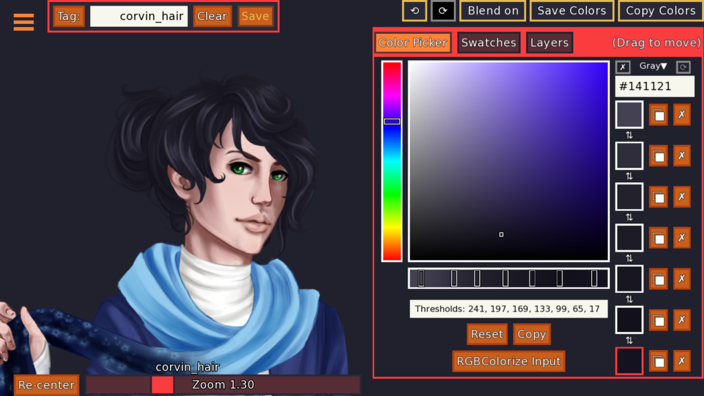
This looks a bit silly of course – so let’s continue by picking slightly lighter and slightly darker colours for the other swatches. Remember you can click the two squares button next to a swatch to copy its colour code so you can paste it into the hexcode input box later, too.
Already looking pretty good! Now I can start adjusting the individual swatches for personal taste. In particular, I’d like to lighten up the highlights a bit more and move the colours more towards blue in some swatches to give the black a bit of depth (rather than shading it with light gray).
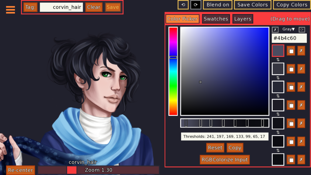
The final colours are #4b4c60, #353540, #252734, #1d1b25, #111118, #0b0b11, #040509.
Example 2 (Red)
Next, let’s try giving Corvin red hair. Again, I’ll start by picking a middling colour to base the rest of the colours off of. Let’s try this one.
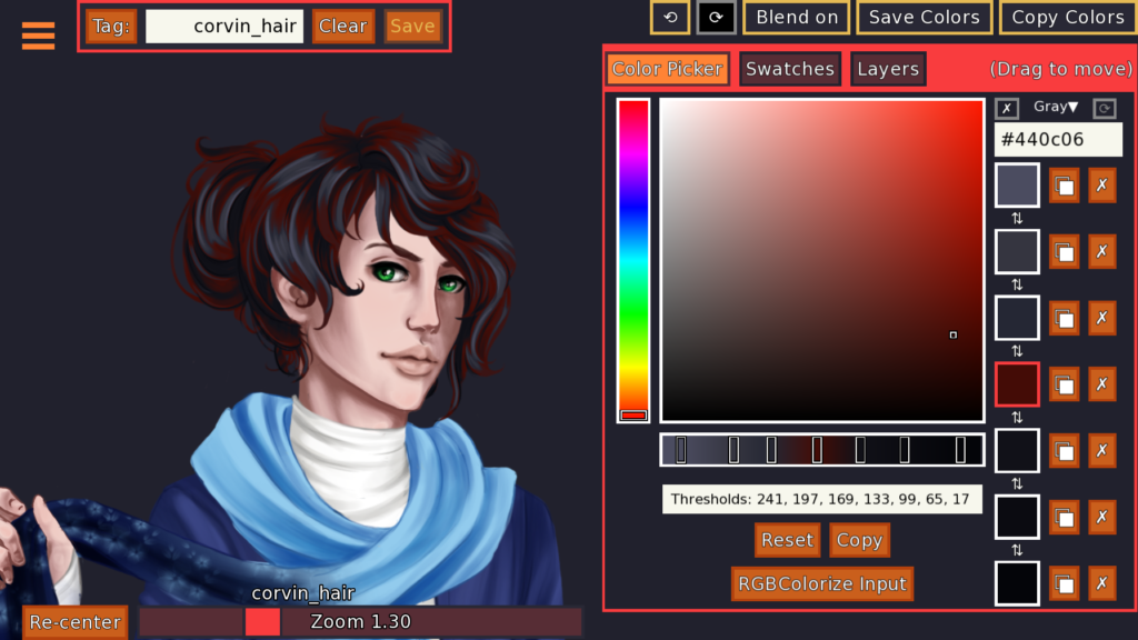
Now I need to pick some shadow colours. Although the main colour is red, it often looks better if the shadow isn’t just a darker red but has a bit of depth with different shades. In this case I’m going for a more purple-toned shadow.
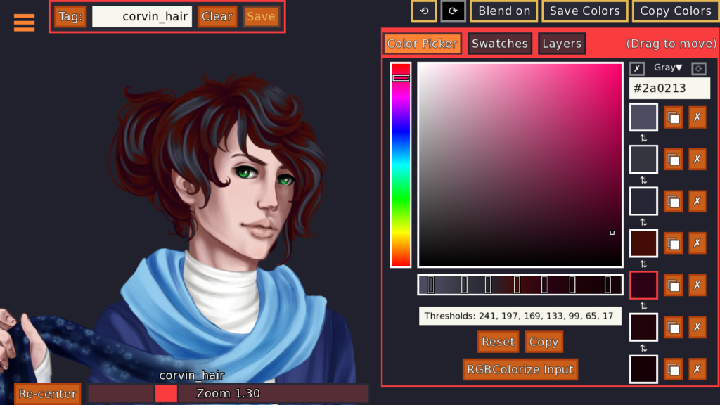
Similar rules apply for choosing the highlight – let’s go for a slightly more orange-y highlight.
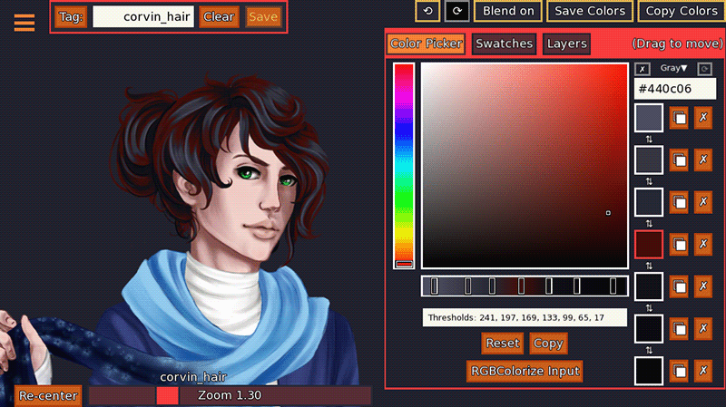
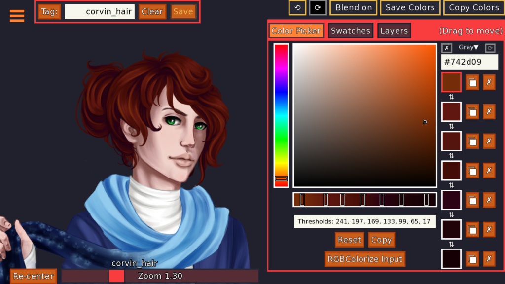
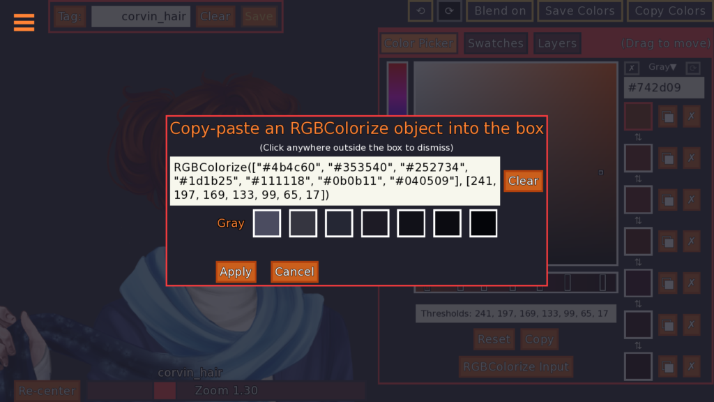
And here’s the final result! The final colours are #742d09, #5f1710, #55140d, #440c06, #2a0213, #200308, #150006.
Applying the colours in-game
Once you have your colour palette all figured out, you can click the “Copy Colors” button in the top right corner to copy a special RGBColorize object to the clipboard, which you can use in your script. There are a few ways to use the RGBColorize object, but the most common will be to use the transform property in conjunction with ATL at or the At displayable.
![An image from the colorize tool showing the "Copy Colors" button selected. A notification reads "Copied "RGBColorize(["#e7fee1", "#9ceebd", "#4d915e", "#2e5a3a", "#000000"], [239, 197, 111, 68, 0])" to clipboard". A tooltip reads "Copy an RGBColorize with the information on the current tag to the clipboard (Ctrl+C)."](https://feniksdev.com/wp-content/uploads/2023/11/save_ss-1024x172.png)
If you’ve picked up the Colorize Tool Extras addon, you can also use the “Save Colors” button at the top right of the screen to save those colours and thresholds to a palette with an optional name so you can find and apply it again later.
Some examples of using the RGBColorize object in-game:
Showing in-script
show potion at RGBColorize(...).transformIn this situation, you’ll paste in the RGBColorize object and add the suffix .transform to turn it into a transform that can apply to the image. The image will then be shown colorized.
Using with pre-defined images
image hair_black = At("mc_hair.png", RGBColorize(...).transform)
image hair_red = At("mc_hair.png", RGBColorize(...).transform)
image hair_blond = At("mc_hair.png", RGBColorize(...).transform)
image hair_brown = At("mc_hair.png", RGBColorize(...).transform)

default mc_hair = "brown"

layeredimage mc:
    always "hair_[mc_hair]"
For this example, several pre-defined images are made with different hair colours. You might use these images in a screen as part of a character creator, for example, and then you can use a variable with dynamic image paths in a layered image later as shown by always "hair_[mc_hair]".
A rough example of a character creator screen using these images might look like:
screen character_creator():
    vbox:
        label _("Hair")
        hbox:
            imagebutton:
                idle "hair_black"
                action SetVariable("mc_hair", "black")
            imagebutton:
                idle "hair_brown"
                action SetVariable("mc_hair", "brown")
            imagebutton:
                idle "hair_red"
                action SetVariable("mc_hair", "red")
            imagebutton:
                idle "hair_blond"
                action SetVariable("mc_hair", "blond")
This would allow the player to choose a hair colour which will then be reflected in the mc sprite, when it is shown in-game.
Further adjusting the colours
And lastly, if you have an RGBColorize object but you want to adjust the colours or the thresholds more, you can use the RGBColorize Input button at the bottom of the Color Picker tab in the Colorize Tool. This will bring up a window you can paste your RGBColorize object into and it will allow you to apply it to the image again. You can hover the preview swatches in the popup to see the exact colour and threshold parsed from your pasted RGBColorize object.
Conclusion
- In order to figure out the thresholds for your image, you need to pick colours from your base grayscale image and use the highest of the RGB values.
- Once you have your thresholds in place, you can put together colour palettes by:
- Colour picking off images made in the same style
- Experimenting freely with colours using the colour picker
- Having your artist make swatches you can use
- You can use the “Copy Colors” button to get a RGBColorize object with the colorizing information, which you can then apply to your images using the
.transformsuffix and ATLatorAt()
I hope this helps you understand how to get the best colorizing results out of your base image! Come back next week for another tutorial on the Better Colorize shader – I haven’t decided on the posting order, but I’ve got several drafted to cover how to separate and format images for recolouring, how to use the RGB colour sets to get even more depth out of your base images and section off areas (e.g. for eyes, mouths), and how to create images from scratch for the shader (vs adapting pre-existing ones). Feel free to let me know which one you’d like to see first!
Be sure to check out Our Life: Beginnings & Always and Changeling also!