
Controller Support Expansion for Ren’Py includes several features to improve controller and keyboard support in Ren’Py. Pick up the tool from itch.io if you haven’t already:
A controller_viewport is a special viewport that can be scrolled with the analog sticks and will update the scroll position based on the currently focused child. It inherits from the built-in Viewport, and so it takes all the same properties as viewport, plus some additional ones for better controller support. See https://www.renpy.org/doc/html/screens.html#viewport for the basic viewport properties.
Terminology
For a controller_viewport, the elements inside of it (e.g. textbuttons, bars, images) are the viewport’s children. Only some children can be interacted with and will be focusable, such as buttons you can press and bars you can adjust. If you are using bars inside the controller_viewport, I recommend that they are Controller Bar bars so they can also be easily adjusted with a controller or arrow keys.
A child that has focus or is focused is the currently selected element. With a mouse, this is the button (or other element like a bar) that your mouse is hovered over. For keyboard and controllers, this is the currently selected button (again, or other element), such that if you hit Enter on the keyboard, it would execute this button’s action. Focused buttons are typically in the hover or selected_hover state.
Examples
The first example is a simple viewport that doesn’t have any kind of focusable elements in it like buttons – so, only text, images, etc. This is a common viewport style to use for the History screen or About screen.
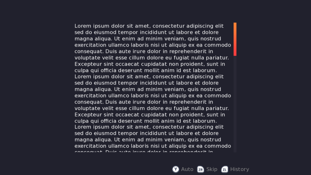
screen text_only_viewport():
    side 'c r':
        align (0.5, 0.5) xysize (1000, 800)
        controller_viewport:
            id "my_viewport"
            mousewheel True draggable True pagekeys True
            arrowkeys "not sticks"
            which_stick "both"
            has vbox
            for i in range(10):
                text "Lorem ipsum dolor sit amet, (...omitted for brevity)"

        vbar value YScrollValue("my_viewport") style 'vscrollbar' keyboard_focus False
There are a lot of properties set up here, so let’s take a look at them one by one.
mousewheel True, draggable True, and pagekeys True are all as seen in the Viewport docs. They allow the mousewheel and pagekeys to scroll the viewport, as well as holding and dragging. id "my_viewport" is also standard to assign an ID to the viewport, which is used later for the scroll bar.
arrowkeys "not sticks" uses the usual arrowkeys property of viewports, but has a special value: “not sticks” means that the controller sticks don’t use “arrowkey” scrolling. However, the keyboard arrow keys as well as the controller D-pad can still scroll the viewport in the “arrowkey” style, which scrolls in “steps”.
which_stick "both" means that both the left and right controller sticks can scroll the viewport. This could also be set to just “left” or “right”.
And that’s all! The other thing of note in this example is the vbar, which has keyboard_focus False to prevent the arrow keys/controller sticks/dpad from selecting the scroll bar, since the sticks can scroll the viewport already. You can read about keyboard_focus here.
For this next example, we’ll look at a few ways you can do multiple viewports.
Version 1
screen two_viewports():
hbox:
spacing 100 align (0.5, 0.5)
side 'c r':
xysize (700, 800)
controller_viewport:
id "left_vp"
which_stick "left" mousewheel True
has vbox
for i in range(10):
text "Lorem ipsum dolor sit amet..."
vbar value YScrollValue("left_vp") style 'vscrollbar' keyboard_focus False
side 'c r':
xysize (700, 800)
controller_viewport:
id "right_vp"
which_stick "right" mousewheel True
has vbox
for i in range(10):
text "Lorem ipsum dolor sit amet..."
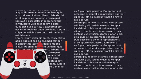
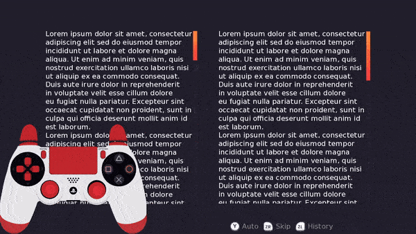
vbar value YScrollValue("right_vp") style 'vscrollbar' keyboard_focus FalseNothing we haven’t seen before in the first example here – the main change is that we have which_stick "left" for the left viewport, and which_stick "right" for the right viewport. This means they can be scrolled independently!
Version 2
screen two_viewports_v2():
    hbox:
        spacing 100 align (0.5, 0.5)
        side 'c r':
            xysize (700, 800)
            controller_viewport:
                id "left_vp"
                which_stick "right" mousewheel True absorb_events True
                has vbox
                for i in range(10):
                    text "Lorem ipsum dolor sit amet..."

            vbar value YScrollValue("left_vp") style 'vscrollbar' keyboard_focus False

        side 'c r':
            xysize (700, 800)
            controller_viewport:
                id "right_vp"
                which_stick "right" mousewheel True absorb_events False
                has vbox
                for i in range(6):
                    text "Lorem ipsum dolor sit amet..."

            vbar value YScrollValue("right_vp") style 'vscrollbar' keyboard_focus False
This example is almost identical to the previous one, except both sticks use which_stick "right" to scroll. Note also that the last viewport has absorb_events False and the backmost one has absorb_events True; this ensures that the backmost viewport will receive any pad_righty_pos events as well, if necessary.
Example 3 – Viewport with Buttons
![A viewport that has several rows of buttons lined up in columns. Each row has a title in the form "Sample title for option [num]" and has three buttons side by side below it labelled Button 1-3.](https://feniksdev.com/wp-content/uploads/2025/01/viewport_with_buttons.gif)
screen button_viewport():
    side 'c r':
        align (0.5, 0.5) xysize (1000, 800)
        controller_viewport:
            mousewheel True draggable renpy.variant("touch")
            id "my_viewport" vscroll_style "nudge"
            scroll_delay (0.2, 0.2)
            extra_scroll dict(up=-100, down=100)
            trap_focus ("up", "down", "left", "right")
            has vbox
            xsize 1000 spacing 20
            for i in range(12):
                text "Sample title for option {}".format(i+1)
                hbox:
                    spacing 50
                    for j in range(3):
                        textbutton "Button {}".format(j+1):
                            style 'tbutton'
                            if i == 0 and j == 0:
                                default_focus True
                            action Notify("Button {} pressed".format(i+1))

        vbar value YScrollValue("my_viewport") style 'vscrollbar' keyboard_focus False
Once again, we’ll go through the properties one-by-one. Here’s just the relevant part, for clarity:
controller_viewport:
    mousewheel True draggable renpy.variant("touch")
    id "my_viewport" vscroll_style "nudge"
    scroll_delay (0.2, 0.2)
    extra_scroll dict(up=-100, down=100)
    trap_focus ("up", "down", "left", "right")
First up, mousewheel True is standard to make the mousewheel scroll the viewport for mouse users. draggable renpy.variant("touch") is slightly different; only users on touch devices can drag to move this viewport. This is sometimes needed to prevent the viewport itself from gaining focus rather than the items inside it when using the keyboard/controller.
Next is the viewport ID as usual, and now a new property vscroll_style "nudge". This gives the viewport a “scrolling style” to keep the focused child in-view by scrolling the viewport. In this case, “nudge” scrolls only as far as is needed so the child is fully visible.
scroll_delay takes two numbers – the first is how long to scroll horizontally to the new position (along the x axis) and the second is how long to scroll vertically to the new position (along the y axis). Usually these can be the same.
extra_scroll_dict scrolls a little extra in the new direction. This is helpful for this layout, which has headers for the button rows – without using the extra_scroll_dict, when scrolling up, buttons at the top of the viewport would be focused but their headers would not be visible.
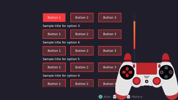
For symmetricality, and to indicate there are more buttons below the currently focused one, it also adds some extra scrolling in the “down” direction. up=-100 means that the viewport should scroll an extra -100 pixels (negative being up) when it focuses something above the currently focused child. down=100 means that the viewport should scroll an extra 100 pixels when it focuses something below the currently focused child.
The vscroll_style "center" also handles this problem well – it tries to keep the currently focused child in the center of the viewport, so you should always be able to see any headers above the current focus.
Lastly, trap_focus ("up", "down", "left", "right") means that moving the arrow keys or controller sticks around to focus things inside the viewport should not cause focus to leave the viewport. This prevents accidentally focusing buttons outside the viewport, such as the quick menu.
Extra Properties to Try
For this layout, you may also consider some of the wrapping properties, such as row_limit_wrap "next" and start_end_wrap "row". The first will make it so hitting Right on Button 3 in Row 1 will focus Button 1 in Row 2. The second will make it so hitting Left on Button 1 in Row 1 (the first row) will focus Button 3 in the final row.
There are many more options for scrolling styles as well – take a look at the Properties section for all the other properties that can be used to customize the behaviour of the controller viewport.
Properties
Besides the default viewport properties (see Viewport in the Ren’Py docs), controller_viewport also has the following custom properties:
vscroll_style
The style of scrolling to use when adjusting the vertical scroll. The default value is None. The possible values are:
“center”
Scrolls the viewport to put the currently focused child in the center of the viewport where possible. If the child is at the edge of the viewport, it will simply scroll as far as it can to put the child as close to the center as possible. You can add null space around your viewport children if you’d like them to always be fully centered. This is one of the most common scrolling styles, as it ensures the player can always see buttons around the currently focused one.
“nudge”

Will not scroll the viewport unless the currently focused child is out of view. If the child is not fully visible within the viewport, the viewport will scroll only as much as is necessary to put it in view. E.g. if the child is just below the currently focused button and is out of view, focusing that child will scroll so it is at the bottom of the viewport.
“start”
Ensures the currently focused child is always at the top of the viewport.
“page”

Will not scroll unless the currently focused child is out of view, in which case it will adjust the scroll to put the child at the top of the viewport (if focusing down) or the bottom of the viewport (if focusing up).
(yanchor, ypos)
vscroll_style may also be provided a tuple, in which case the values are equal to (yanchor, ypos) where yanchor is the anchor point on the focused child and ypos is the position relative to the viewport window where the anchor point is positioned. So, (0.5, 0.5) is equivalent to the "center" scroll style, and (0.0, 0.0) is equivalent to the "start" scroll style. Something like (1.0, 0.5) would put the bottom of the child at the center of the viewport.
The tuple values can be floats, integers, or the special position type (see https://www.renpy.org/doc/html/style_properties.html#position for more).
None
If None, the default, the viewport will not scroll vertically to keep the currently focused child in view.
e.g. vscroll_style (0.5, position(200, 0.5))
hscroll_style
The style of scrolling to use when adjusting the horizontal scroll. As for vscroll_style above, but with priority for putting the child at the left edge of the viewport instead of the top for "page" and "start". If provided a tuple, it is (xanchor, xpos) instead. Default is None.
e.g. hscroll_style "center"
scroll_delay
A tuple of two floats. The first float is the time to scroll horizontally to the new position, and the second is the time to scroll vertically to the new position. Set this to (0.0, 0.0) for no scrolling animations.
e.g. scroll_delay (0.2, 0.3)
scroll_warper
The warper to use for scrolling animations. Can be a string like "linear", in which case it must be the name of one of the built-in warpers (see https://www.renpy.org/doc/html/transforms.html#warpers). Otherwise, it can be a callable which will be passed a value between 0.0 and 1.0 and is expected to return a float. Default value is "ease".
e.g. scroll_warper "easein"
trap_focus
If not None, this should be a tuple with some subset of "left", "right", "up", and "down". Focus will be trapped in the viewport in the provided directions. So, if "right" is trapped, then pressing right will not leave the viewport. A value of ("left", "right", "up", "down") will prevent any focus input from leaving the viewport.
This can be used to prevent unintentionally leaving the viewport when scrolling. The default value is None, so no focus directions are trapped.
e.g. trap_focus ("up", "down")
As a further example of when you might use this: if you consider a layout like below, where the viewport is on top of the quick menu buttons and a Return button:
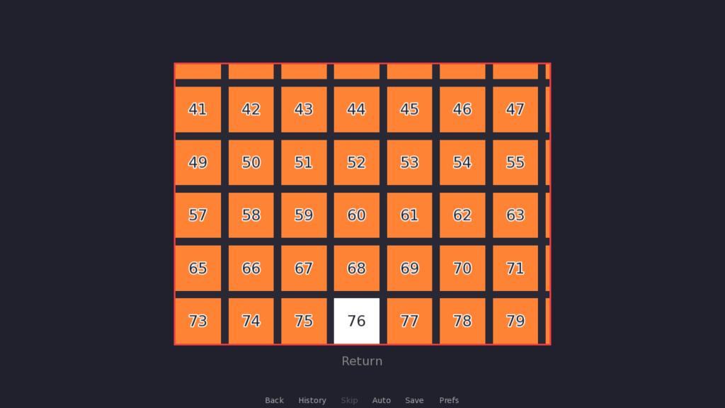
without including “down” in trap_focus, pressing down while highlighting button 76 will cause Ren’Py to attempt to focus the Return button outside of the viewport. If “down” is in trap_focus, then focus will simply stay on button 76, as it is the bottommost button in the viewport.
which_stick
Which controller stick can be used to scroll the viewport. One of:
“left”
The left controller stick can be used to smoothly scroll the viewport.
“right”
The right controller stick can be used to smoothly scroll the viewport.
“both”
The left and right controller sticks can both be used to smoothly scroll the viewport.
None
Neither of the controller sticks will scroll the viewport. This is the default value.
Typically this property should be used for viewports without focusable children. Otherwise, it’s preferred to let the focused child change the scroll position with the help of vscroll_style and hscroll_style.
e.g. which_stick "right"
absorb_events
If True, the default, this viewport will absorb stick events when which_stick is not None, to avoid focus issues. If you have more than one viewport that can be controlled with the same controller stick, you may want to set this to False for all but the backmost viewport (the farthest back in the screen order). This property is only important if focus_scroll is False. It also only blocks stick events in the event method (e.g. pad_leftx_pos) – it will not block other StickEvents from updating based on the current value of the sticks.
e.g. absorb_events False
focus_scroll
If True, the viewport will only scroll when it is focused (i.e. you have to navigate over to it and then you can start using the sticks to scroll it). If False, the controller stick(s) can scroll the viewport even if it is not focused. By default, this is False.
e.g. focus_scroll True
shortcuts
If True, the shortcut button + the up/down directions will scroll to the top/bottom of the viewport, and the shortcut button + left/right will scroll to the left/right side respectively. Default is False. The shortcut button is set up as a custom controller mapping, but is set to R1 by default and not remappable.
This is just a convenience feature to make it easy to get to the start/end of a viewport, and is particularly useful for viewports with a lot of content such as the history screen. It can be used both for viewports without any focusable children as well as for viewports with scroll styles and focusable children. If the viewport has focusable children, the shortcut will change focus to the topmost child when pressing shortcut + up (and the same happens for the other directions).
e.g. shortcuts True
extra_scroll
If not None (the default), this is a dictionary with direction : amount pairs. If something inside the viewport is focused and it moves the viewport in the provided direction, the viewport will scroll in that direction plus the extra scroll amount.
This can be used if you’re trying to keep a title/subtitle in view while scrolling, or if you want to make sure the next row/column of children is visible when navigating the viewport. For example, extra_scroll {"up" : 100, "down" : 100} will scroll an extra 100 pixels up or down when focusing something above/below the current child.
This may also have an id : focus_dict pair, where the key is the ID of a displayable and the value is a dictionary like above with direction : amount pairs. When a displayable with that ID is focused, it will first look up the dictionary associated with the ID to find the extra scroll amount, and if that does not exist, then it will look up the regular directional amount of extra scroll.
e.g. extra_scroll {"up" : 80, "long_title_btn" : {"up", 140}}
focus_displayables
If you’re using FocusDisplayable on this screen, it should be provided to this list so they are updated when the viewport is scrolling. This should be a list of FocusDisplayable.
e.g. focus_displayables [ f1 ] (where f1 was declared like default f1 = FocusDisplayable(...))
alternatively, focus_displayables [ "my_disp" ] (where my_disp was declared like image my_disp = FocusDisplayable(...))
column_limit_wrap
When hitting up/down while focused on a child at the top/bottom of the viewport, this property describes the behavior of what to focus next. It can have the following values:
“next”
If “down” is pressed while focused on the bottommost child in a column, this will focus the top child in the next column (the one to the right of the current one). Similarly, if “up” is pressed while focused on the topmost child in a column, this will focus the bottommost child in the previous column (to the left of the current one).
“loop”
If “down” is pressed while focused on the bottommost child in a column, this will focus the topmost child in the same column. Pressing “up” while focused on the topmost child will focus the bottommost child in the same column.
None
The default. Pressing “down” on the bottommost child will either do nothing if focus is trapped or there is nothing to focus below the viewport, or it will focus something outside the viewport, and same for pressing “up”.
e.g. column_limit_wrap "loop"
row_limit_wrap
When hitting left/right while focused on a child at the leftmost/rightmost side of the viewport, this property describes the behavior of what to focus next. It can have the following values:
“next”

If “right” is pressed while the rightmost child in a row is focused, this will focus the leftmost child in the next row (the one below the current one). Similarly, if “left” is pressed while the leftmost child in a row is focused, this will focus the rightmost child in the previous row (the one above the current one).
“loop”
If “right” is pressed while the rightmost child in a row is focused, this will focus the leftmost child in the same row. Similarly, if “left” is pressed while the leftmost child in a row is focused, this will focus the rightmost child in the same row.
None
The default. Pressing “left” on the leftmost child in a row will either do nothing if focus is trapped or nothing is to the left of the viewport, or focus will leave the viewport to focus something to the left of it. The same occurs when pressing “right” on the rightmost child in a row.
e.g. row_limit_wrap "next"
start_end_wrap
This property dictates what should happen if the leftmost, topmost child is focused and the up/left button is pressed, and same for the bottommost, rightmost child when down/right is pressed. It can have the following values:

True
Hitting up/left on the topmost, leftmost child will focus the bottommost, rightmost child, and vice versa.
False
The default. No special wrapping behaviour will be applied when focusing the first or last child.
“row”
Wraps from the first to the last child only with the left/right directions.
“column”
Wraps from the first to the last child only with the up/down directions.
e.g. start_end_wrap "row"
penalty
A penalty applied to distances outside of the preferred focus direction. By default, if you press “down” while focused on a button, a penalty will be applied to buttons which are to the left/right of the currently focused button. A similar penalty is applied to children above/below the currently focused child if you are trying to focus something to the left or right. By default, this is set to https://www.renpy.org/doc/html/config.html#var-config.focus_crossrange_penalty. You can set it to a smaller number to avoid skipping over focusable elements, particularly for grid-based or column/row layouts.
e.g. penalty 64
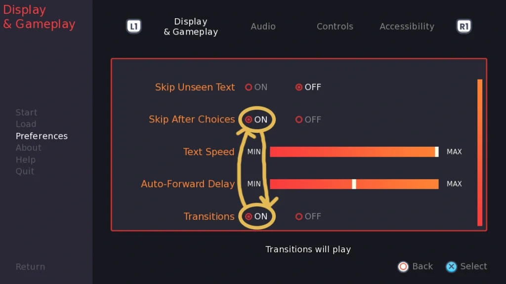
For example, here is a settings screen where the focus relationship isn’t what we want. Ideally, while focused on the Skip After Choices ON button, pressing down should focus the Text Speed bar. Similarly, pressing up while focused on the Transitions ON button should focus the Auto Forward Delay bar. However, currently the bars are fully skipped.
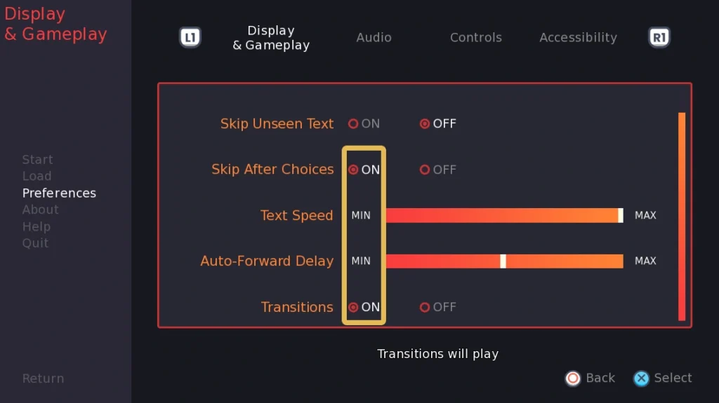
This is because the MIN text is not focusable, just the bar. If we draw a rectangle around the edges of the ON buttons, we can see that they don’t overlap with the bars at all, just with the MIN text. By default, this means that Ren’Py will apply a multiplier (penalty) to how far away the bar is, to avoid focusing things that are too far to the left or right to be rationally seen as being the next thing to focus when pressing up/down. In some circumstances, this penalty may make sense. In this case, everything is aligned in rows, so the left/right distance doesn’t really matter since they will all be more or less in the same column.
So, to fix this, we can reduce the penalty multiplier that is applied to the distance of the bars. Generally you can play around with slowly making the number smaller until it results in the focus behaviour you want. If you’re still having trouble with focus relationships, you can look into KeyController and focused_on.
cache_reverse
If True, the default, the viewport will cache focus relationships between children with the assumption that they are symmetrical. So, for example, say you have buttons A and B side by side like A B. If you are focused on A and hit right, the viewport changes focus to B and records that hitting right on A focused B in order to easily look up that information again later. When cache_reverse is True, the default, this will also record that hitting left while focused on B should focus A. Most layouts will support this kind of symmetrical focus relationship, but if your layout does not, set this to False.
e.g. cache_reverse False
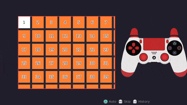
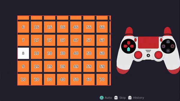
The following is an example of a layout which would be unsuitable for cache_reverse, so cache_reverse should be set to False:
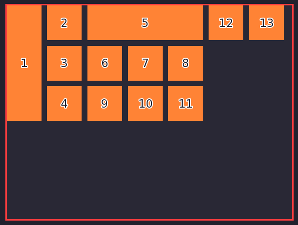
That’s because if you are focused on 1 and press right, it will focus on 2. This would create a relationship between 1 and 2, such that pressing left while focused on 2 would focus 1. However, if you instead started on 4 and pressed left, it would focus 1 and create a relationship between 4 and 1 instead so that pressing right on 1 would focus 4. This results in inconsistent behaviour depending on which button you began focus on before focusing on 1.
You should typically also set cache_reverse to False if you are using the KeyController class (and its screen language equivalent, focused_on) to fine-tune the focus relationships between children.
arrowkeys
Besides the regular values that arrowkeys takes in a typical viewport, the controller viewport takes two other possible values:
“keyboard”
If arrowkeys is set to “keyboard”, then only the keyboard keys can scroll the viewport. This prevents the arrowkey scrolling from taking priority over the smooth stick scrolling for controllers, but still allows keyboard users to scroll the viewport with the arrow keys.
“not sticks”
If arrowkeys is set to “not sticks”, then the keyboard and the D-pad on the controller can scroll the viewport. As with “keyboard”, this prevents the arrowkey scrolling from taking priority over smooth scrolling for controllers, but allows both the keyboard and D-pad to do the step-style arrowkey scrolling.