
Controller Support Expansion for Ren’Py includes several features to improve controller and keyboard support in Ren’Py. Pick up the tool from itch.io if you haven’t already:
To make it easy to communicate to a player what buttons can be pressed to perform different actions, Controller Support Expansion for Ren’Py comes with a special IconButton class to simplify displaying gamepad or keyboard icons to the player. The gamepad icons come in several layouts – Xbox, PlayStation, Nintendo, Steam, and a generic layout. These can be switched by the player at any time and are automatically handled when using the IconButton class.
Examples
Example 1
First, let’s briefly look at an example of what we’re working towards:
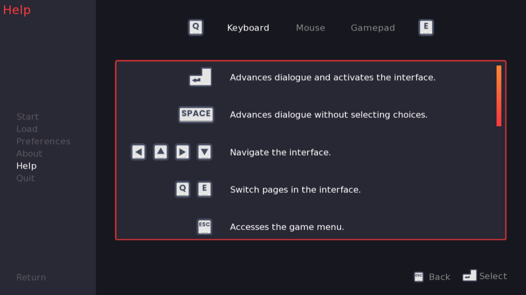
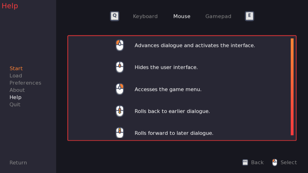
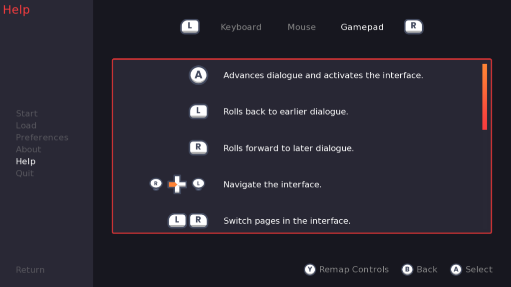
From left to right, the screens shown above are what the game looks like when played with a keyboard, with a mouse, and with a controller. Of particular note are the two buttons used for switching tabs (Q and E on mouse/keyboard, and L/R for controller), and the two icons at the bottom right corner of the screen (ESC and Enter for keyboard, ESC and left mouse button for mouse, and B and A for Controller – plus Y for remapping controls). Let’s look at the code for the page tabs first.
hbox:
    ## The icon shortcut to change pages
    icon_button caption _("Previous Page") kind icn.page_left:
        action CycleScreenVariable("device", tabs, reverse=True)
        icon_only True
    ## Buttons to change pages; can be clicked with the mouse, but
    ## not focused with arrow keys
    textbutton _("Keyboard") keyboard_focus False:
        action SetScreenVariable("device", "keyboard")
    textbutton _("Mouse") keyboard_focus False:
        action SetScreenVariable("device", "mouse")
    textbutton _("Gamepad") keyboard_focus False:
        action SetScreenVariable("device", "gamepad")
    ## The icon shortcut to change pages
    icon_button caption _("Next Page") kind icn.page_right:
        action CycleScreenVariable("device", tabs)
        icon_only True
In particular, it uses the special icon_button displayable to display the Q and E/L and R icons. Let’s look at the one for changing the page left:
## The icon shortcut to change pages
icon_button caption _("Previous Page") kind icn.page_left:
    action CycleScreenVariable("device", tabs, reverse=True)
    icon_only True
First is the property caption. This is the text displayed next to the button icon if applicable, or the alt text if the caption is not shown. In this case, the caption is hidden because icon_only True means the icon only has the icon image, not the text caption as well.
Next is the property kind. This is a special kind of property that’s meant to speed up declaring icons of a similar type. If you provide an IconButton to the kind property, the icon_button will inherit properties from it unless they are overwritten by other properties. In this case, the declaration for icn.page_left can be found in controller_icons.rpy near the bottom of the file:
define icn.page_left = IconButton(pad_event="page_left", key_event=["Q", "q"],
    caption=_("Previous"), mkb_icon="key_q")
First up we have pad_event. This should be set to an event name as found in persistent.pad_bindings – that is, it needs to either be a standard Ren’Py event, or a custom one (as added in Remapping Controls). "page_left" is a custom event that was added for this expansion pack.
Next is key_event – this should be a list of valid keyboard key events as described in Customizing the Keymap. Here, the chosen keyboard key for page left is Q.
caption is as described before – it’s the text shown next to the button icon, or if the text is not shown, the alt text for the icon. Notably, because the icon_button in the screen above uses the caption property, it takes priority over the one declared here.
Finally, mkb_icon stands for “mouse/keyboard icon”. It’s the icon image that will be used for the mouse/keyboard. Images in the pad_config.ICON_FOLDER (see Configuration Variables) that start with "mouse_" or "key_" are automatically declared. Here, we want the icon for the Q key.
So, back to the icon_button – due to kind icn.page_left, it inherits the pad_event, key_event, and mkb_icon properties from that Iconbutton. The last property we haven’t covered is action, which is the action to perform when the correct shortcut is pressed, or the icon button itself is clicked. So, in this case, it’s the action to perform when the Q key on the keyboard is pressed, or the page_left button for a controller (which is the left shoulder button by default). In this case, it cycles the Help screen tabs in reverse.
Example 2
Also in the screens for Example 1 are button prompts found in the bottom right corner. Those are handled with icon_button, and organized using a special screen called key_footer:
use key_footer():
    if GamepadExists():
        icon_button kind icn.reset suffix "small":
            caption _("Remap Controls")
            action ShowMenu("controller_remap")
    icon_button kind icn.menu_return suffix "small"
    icon_button kind icn.select suffix "small"
All the key_footer class does is have an hbox with styling to put the icons in the bottom right corner of the screen.
First up is the icon button for the “Remap Controls” shortcut. This one inherits from icn.reset, which is also found in controller_icons.rpy with the following definition:
define icn.reset = IconButton("extra_menu", ["r", "R"], _("Reset"), "key_r")In particular, it uses the custom “extra_menu” event, and is mapped to the R key on a keyboard.
The icon_button overwrites the caption to be more specific to what this button will do on this screen – namely, that it will take the player to the control remapping screens. The action property is here as well, with the action to go to the controller_remap screen. The last new property is suffix "small" – this appends a suffix onto the icon image names. By default, all mouse/keyboard/controller icons have a _small variant that is a suitable size for these kinds of footers.
The second icon_button is the Back button. Nearly all the properties are inherited from the icn.menu_return IconButton, which uses the escape keyboard key and the custom “cancel” event. It also has the action MenuReturn() which is a special action that helps manage saving and restoring focus between the game/main menus and in-game.
The final icon_button is the Select button. It inherits from icn.select, whose declaration is as follows:
define icn.select = IconButton("button_select",
    ## The key event doesn't use button_select because it would absorb
    ## mouseup events, interfering with using screens with a mouse.
    key_event=['K_RETURN', 'K_KP_ENTER', 'K_SELECT'],
    caption=_("Select"),
    mkb_icon="mkb_select")
In particular, the mkb_icon is an icon called “mkb_select”, which is declared earlier in the controller_icons.rpy file as:
image mkb_select = FocusTypeDisplayable("mouse_left", "key_enter")Briefly, this is a special kind of displayable whose image is updated in real-time without requiring a screen refresh whenever the input type changes. It takes three arguments – a mouse_img, a keyboard_img, and a controller_img (any of which can be omitted, as in this case where it’s only used for mouse and keyboard). By default, the screen is refreshed only when switching to and from controller input, so switching from mouse to keyboard or vice-versa won’t update the icons. If using a FocusTypeDisplayable, however, the image will update when the focus type changes. In particular, this image switches between a left mouse button icon to the enter key.
Properties
IconButton (and its screen language version, icon_button) take several properties to define the behaviour of the button and its appearance.
pad_event
Required. This should be the string name of a gamepad event, either a custom one or a built-in one. See Remapping Controls for more on adding custom events.
e.g. pad_event "screenshot"
key_event
Similar to pad_event, this should be the string name of a key, or a list of such key names, as described in Customizing the Keymap. These can also be event names as used in config.keymap.
e.g. key_event ['K_ESCAPE', 'mouseup_3']
e.g. key_event "game_menu"
caption
The text to display alongside the button icon, if icon_only is False. In that case, the caption is used for the alt text of the icon.
e.g. caption _("Return")
mkb_icon
Short for “mouse and keyboard icon”. The icon that will be used when the mouse or keyboard is the last used input type. Should be a string corresponding to an image name, or a list of such strings. In order to work with the suffix property, this needs to be a declared image which can have suffixes added onto the end of it.
e.g. mkb_icon "key_escape"
action
The action to perform when this button is clicked, or one of the various keys is pressed (e.g. if key_event="K_ESCAPE", then this action will happen when the Escape key is pressed, or if the icon_button on the screen is clicked with the mouse.
e.g. action Return()
activate_sound
A sound to play when the action is executed.
e.g. activate_sound "boop.ogg"
suffix
A suffix to add onto the end of the images used for this icon. Most common is simply "small". If mkb_icon="key_q" then this will use the image "key_q_small" for the mouse and keyboard.
e.g. suffix "small"
use_keysym
If True, the default, the icon_button will automatically listen for and handle key presses corresponding to the event(s) it is listening for. If False, the icon may be pressed with the mouse to execute its action, but will not respond to any of its shortcuts being pressed. In most cases this should stay as True, unless there is some kind of redundancy in your screen or the key presses are situational in some way.
e.g. use_keysym False
icon_only
If True, the icon_button’s caption will not be shown next to the button icon.
e.g. icon_only True
keymap_only
If True, the icon and caption will not be shown, but the icon_button will still listen for events that match the pad_event or key_event values given to it, and execute its action where appropriate.
e.g. keymap_only True
hide_on_mouse
If True, the icon_button will just be a Null displayable when the mouse is being used (i.e. it will be invisible). False by default.
e.g. hide_on_mouse True
hide_on_keyboard
If True, the icon_button will just be a Null displayable when the keyboard is being used (i.e. it will be invisible). False by default.
e.g. hide_on_keyboard True
hide_on_controller
If True, the icon_button will just be a Null displayable when a controller is being used (i.e. it will be invisible). False by default.
e.g. hide_on_controller True
kind
kind takes another IconButton object and will inherit all the properties from it, except where those properties have been overwritten in the declaration for this icon button.
e.g. kind icn.select
hbox_ properties
You may also pass in properties prefixed with hbox_, which will be passed to the hbox that’s used to contain the icon and text. See Box Style Properties.
e.g. hbox_spacing 50
text_ properties
You may also pass in properties prefixed with text_, which will be passed to the caption text. See Text Style Properties.
e.g. text_color "#FFF"
You may also pass in button style properties, which will be passed to the containing button. See Button Style Properties.
e.g. padding (20, 20)
FocusTypeDisplayable
This is a special kind of displayable which will change its image in real-time based on the last used input type. It has three arguments:
mouse_img
The image used when the mouse is the last used input type. Can be any kind of displayable.
keyboard_img
The image used when the keyboard is the last used input type. Can be any kind of displayable.
controller_img
The image used when the controller is the last used input type. Can be any kind of displayable.
e.g. image cancel_img = FocusTypeDisplayable("mouse_right", "key_escape", "pad_b")